ShopDreamUp AI ArtDreamUp
Laghrian has limited the viewing of this artwork to members of the DeviantArt community only.
You can log in or become a member for FREE.
Deviation Actions


![[AT] Don't be shy, come with me!](https://images-wixmp-ed30a86b8c4ca887773594c2.wixmp.com/f/c24cda59-5d0c-4a18-831e-d5dcf915ab00/da05tnc-d104eedc-e11f-4b02-8696-e48457eee4cb.jpg/v1/crop/w_184,h_184,x_0,y_28,scl_0.086142322097378,q_70,strp/_at__don_t_be_shy__come_with_me__by_wylfen_da05tnc-92s-2x.jpg?token=eyJ0eXAiOiJKV1QiLCJhbGciOiJIUzI1NiJ9.eyJzdWIiOiJ1cm46YXBwOjdlMGQxODg5ODIyNjQzNzNhNWYwZDQxNWVhMGQyNmUwIiwiaXNzIjoidXJuOmFwcDo3ZTBkMTg4OTgyMjY0MzczYTVmMGQ0MTVlYTBkMjZlMCIsIm9iaiI6W1t7ImhlaWdodCI6Ijw9MjU2MSIsInBhdGgiOiJcL2ZcL2MyNGNkYTU5LTVkMGMtNGExOC04MzFlLWQ1ZGNmOTE1YWIwMFwvZGEwNXRuYy1kMTA0ZWVkYy1lMTFmLTRiMDItODY5Ni1lNDg0NTdlZWU0Y2IuanBnIiwid2lkdGgiOiI8PTE2MDAifV1dLCJhdWQiOlsidXJuOnNlcnZpY2U6aW1hZ2Uub3BlcmF0aW9ucyJdfQ.jYgsSxzTUbBHWAv1TC_NE1i8EjWhQtBey16B7DFf8ZU)
![[AT] Don't be shy, come with me!](https://images-wixmp-ed30a86b8c4ca887773594c2.wixmp.com/f/c24cda59-5d0c-4a18-831e-d5dcf915ab00/da05tnc-d104eedc-e11f-4b02-8696-e48457eee4cb.jpg/v1/crop/w_92,h_92,x_0,y_14,scl_0.043071161048689,q_70,strp/_at__don_t_be_shy__come_with_me__by_wylfen_da05tnc-92s.jpg?token=eyJ0eXAiOiJKV1QiLCJhbGciOiJIUzI1NiJ9.eyJzdWIiOiJ1cm46YXBwOjdlMGQxODg5ODIyNjQzNzNhNWYwZDQxNWVhMGQyNmUwIiwiaXNzIjoidXJuOmFwcDo3ZTBkMTg4OTgyMjY0MzczYTVmMGQ0MTVlYTBkMjZlMCIsIm9iaiI6W1t7ImhlaWdodCI6Ijw9MjU2MSIsInBhdGgiOiJcL2ZcL2MyNGNkYTU5LTVkMGMtNGExOC04MzFlLWQ1ZGNmOTE1YWIwMFwvZGEwNXRuYy1kMTA0ZWVkYy1lMTFmLTRiMDItODY5Ni1lNDg0NTdlZWU0Y2IuanBnIiwid2lkdGgiOiI8PTE2MDAifV1dLCJhdWQiOlsidXJuOnNlcnZpY2U6aW1hZ2Uub3BlcmF0aW9ucyJdfQ.jYgsSxzTUbBHWAv1TC_NE1i8EjWhQtBey16B7DFf8ZU)


![Godspiel [C]](https://images-wixmp-ed30a86b8c4ca887773594c2.wixmp.com/f/72f18145-3a84-4599-a1c5-be3ae32fb7d6/dddj6f0-abfebaa4-cf99-4353-9767-a5ea1c4b7cb8.png/v1/crop/w_184,h_184,x_0,y_4,scl_0.066860465116279,q_70,strp/godspiel__c__by_hidzia_dddj6f0-92s-2x.jpg?token=eyJ0eXAiOiJKV1QiLCJhbGciOiJIUzI1NiJ9.eyJzdWIiOiJ1cm46YXBwOjdlMGQxODg5ODIyNjQzNzNhNWYwZDQxNWVhMGQyNmUwIiwiaXNzIjoidXJuOmFwcDo3ZTBkMTg4OTgyMjY0MzczYTVmMGQ0MTVlYTBkMjZlMCIsIm9iaiI6W1t7ImhlaWdodCI6Ijw9MTM5NiIsInBhdGgiOiJcL2ZcLzcyZjE4MTQ1LTNhODQtNDU5OS1hMWM1LWJlM2FlMzJmYjdkNlwvZGRkajZmMC1hYmZlYmFhNC1jZjk5LTQzNTMtOTc2Ny1hNWVhMWM0YjdjYjgucG5nIiwid2lkdGgiOiI8PTEyODAifV1dLCJhdWQiOlsidXJuOnNlcnZpY2U6aW1hZ2Uub3BlcmF0aW9ucyJdfQ.CtWIc5MtYPc8EBTOiF3jJYbuHEoNfswb_B4SpkAlhgQ)
![Godspiel [C]](https://images-wixmp-ed30a86b8c4ca887773594c2.wixmp.com/f/72f18145-3a84-4599-a1c5-be3ae32fb7d6/dddj6f0-abfebaa4-cf99-4353-9767-a5ea1c4b7cb8.png/v1/crop/w_92,h_92,x_0,y_2,scl_0.03343023255814,q_70,strp/godspiel__c__by_hidzia_dddj6f0-92s.jpg?token=eyJ0eXAiOiJKV1QiLCJhbGciOiJIUzI1NiJ9.eyJzdWIiOiJ1cm46YXBwOjdlMGQxODg5ODIyNjQzNzNhNWYwZDQxNWVhMGQyNmUwIiwiaXNzIjoidXJuOmFwcDo3ZTBkMTg4OTgyMjY0MzczYTVmMGQ0MTVlYTBkMjZlMCIsIm9iaiI6W1t7ImhlaWdodCI6Ijw9MTM5NiIsInBhdGgiOiJcL2ZcLzcyZjE4MTQ1LTNhODQtNDU5OS1hMWM1LWJlM2FlMzJmYjdkNlwvZGRkajZmMC1hYmZlYmFhNC1jZjk5LTQzNTMtOTc2Ny1hNWVhMWM0YjdjYjgucG5nIiwid2lkdGgiOiI8PTEyODAifV1dLCJhdWQiOlsidXJuOnNlcnZpY2U6aW1hZ2Uub3BlcmF0aW9ucyJdfQ.CtWIc5MtYPc8EBTOiF3jJYbuHEoNfswb_B4SpkAlhgQ)


Description
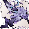
Phew! That is art that I am proud of!
My OC Ulvar traveling somewhere in space...
Follow me on Facebook!


Art by me. Do not steal.
Image size
2625x1411px 2.63 MB
© 2014 - 2024 Laghrian
Comments10
Join the community to add your comment. Already a deviant? Log In
okay, i don't do a lot of critiques, so bear with me here XD
so i think you have a very clear idea of what you want to do here, and it's executed very well. really, the only critiques of this are little things! you have wonderful colors in this piece, the shading is fantastic too. i love the glowy lights and the glowy eye (i'm a sucker for glowing stuff XD ). and your anatomy is spot on as well!
some things i think you can improve on are your fur texture and your composition. the fur is nicely shaded, but it doesn't have the effect of real fur, you know? if it were me, i would try making some of it clumped, not all stringy. i mean, some of it can be that way, like in the mane, but it's good to have a variety of textures in the fur.
some fur tutorials i recommend to take a look at: fav.me/d7qfv98 and fav.me/d496l72
on the topic of composition, i think you have a nice pose, full of action. but the way some things are placed, like the lights in the background could be improved. for example, there are three lights at the far right of your image, and the only other two are spaced out behind the wolf (sorry if i got the species wrong). you could try rearranging the lights to form a pattern, or simply to be more pleasing to the eye.
overall, my suggestions are just nitpicks, and your piece holds up strongly on its own! keep up your work!
hope you found my critique useful c: